Colours For Wellness
Designer Tamarisk McNalty Stephens shares her ideas.
We all know that paint is one of the most cost-effective ways to transform a space, but did you know that colour is also a powerful tool that can affect your energy level, feelings, and overall well-being? Welcome the wellness movement into your home with the strategic use of colour to reduce stress and anxiety and create a peaceful atmosphere.
Understanding the psychological associations of various colours and the impact of colour combinations can help you decide what colours to integrate into your home to create a desired atmosphere – a restful bedroom, a comforting kitchen, an inviting gathering space or a serene spa-like bathroom.
Colours are broadly categorized as either warm, cool or neutral. Warm colours like yellow, orange and red are energizing – they can stimulate appetite, increase heart rate and promote creativity. Cool colours like blues, greens and violets are restful, stabilizing and soothing and can slow the heart rate, lower blood pressure and calm the nervous system.
Colours can also appear to either advance towards you or recede away from you, making items and rooms of the same size appear larger or smaller. Warm hues and/or intense colours typically advance towards the eye. Walls painted in a warm colour will decrease the apparent size of the space, which can help create a cosy atmosphere. If you want a space to feel more expansive, painting the walls a cooler or more muted colour will give the appearance of the walls receding. A large sectional sofa upholstered in a warm hue will appear visually more substantial than the same sectional sofa upholstered in a cooler-toned fabric.
The simplicity of a monochromatic scheme (one dominant colour) tends to be very harmonious, whereas a complementary scheme (two colours opposite on the colour wheel) provides more contrast, which can stimulate the senses – so mix in moderation if your goal is to create a calm environment.
Also, be aware that different sources of natural and artificial light can affect how colour is perceived. A north-facing room with less direct natural light will feel quite different than a room drenched in warm natural light with a south-west exposure.
Here are some colours you can use in your home to help promote wellness:
WHITE
White represents purity and freshness and is airy and calming. Imagine a landscape covered in a fresh blanket of snow. There is a reason white is a go-to wall colour as it offers a calm canvas for the other elements in the space.
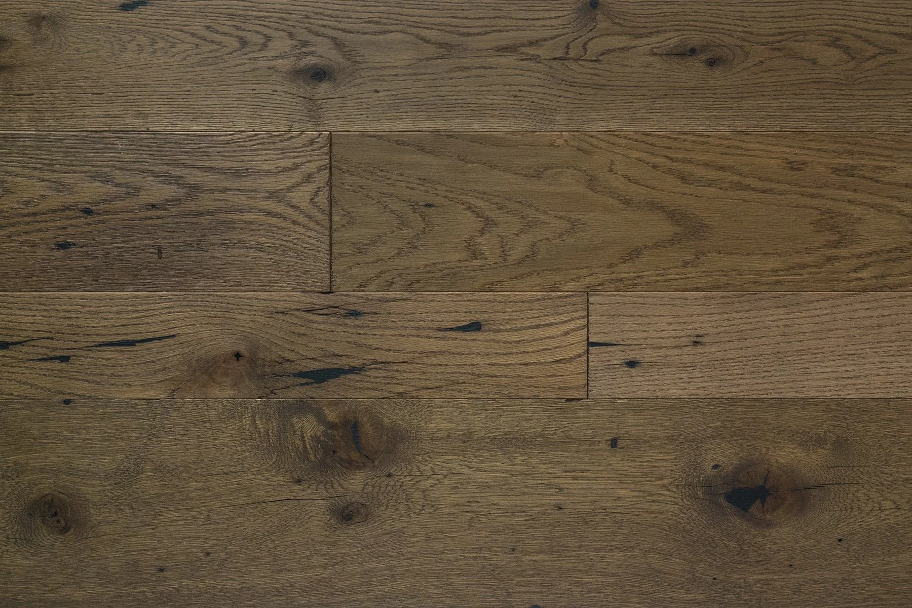
BROWN
Picture the rich, peaty hue of a freshly ploughed field. Earthy and organic with a certain honesty, brown can help create a space that is grounding and comforting. Worn oak floorboards are a great anchor for a space.
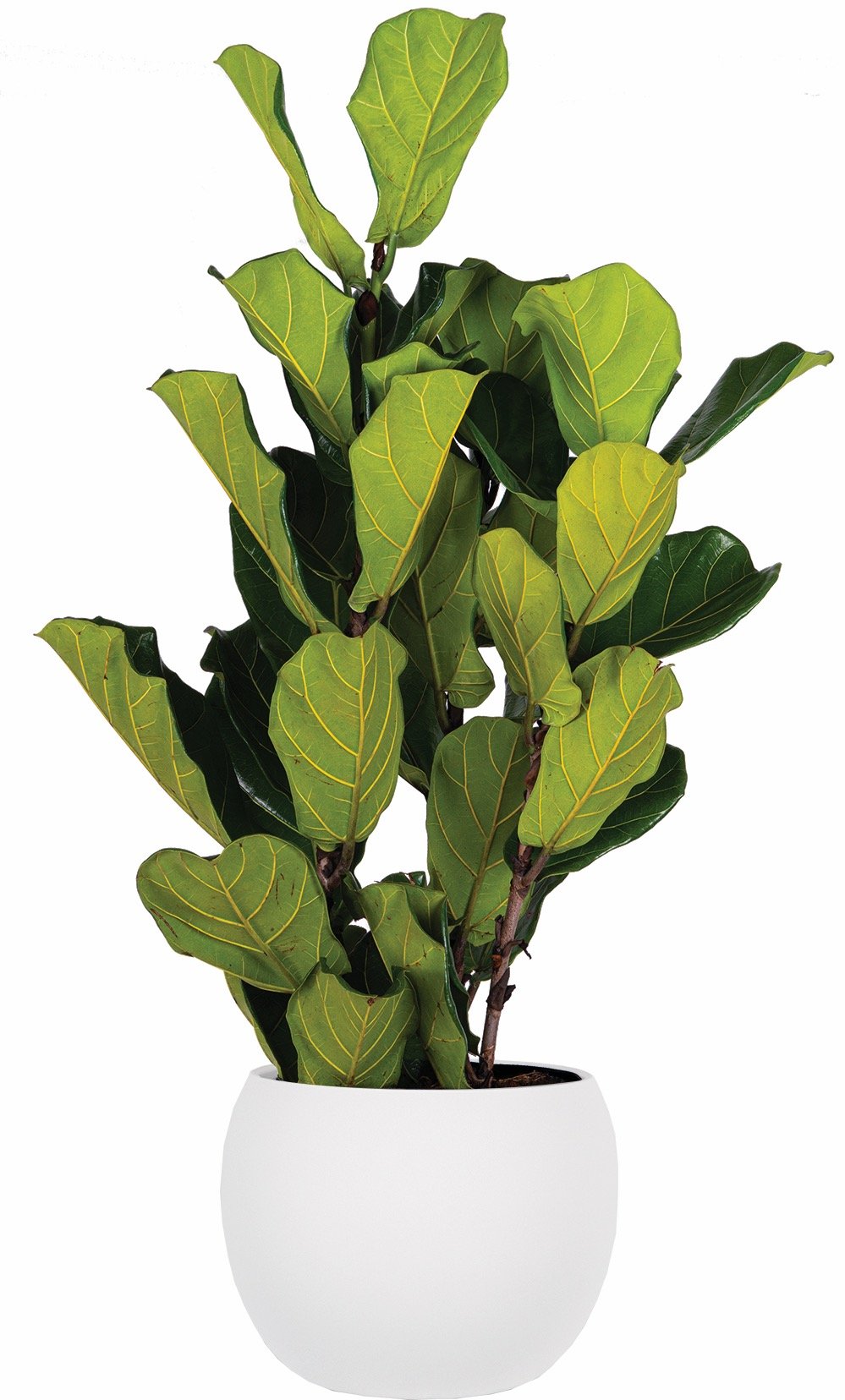
GREEN
There is a reason green saw a resurgence during the pandemic. People spent so much time indoors that they were drawn towards the harmony of nature and healing. Houseplants are a great way to integrate the symbolism green offers into your space – renewal, growth and balance.
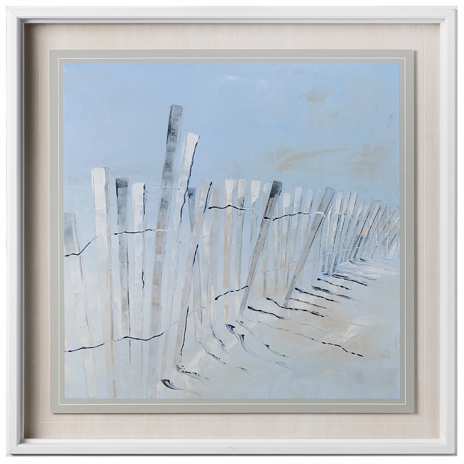
BLUE
Blue is another dominant colour found in nature. The blue expanse of the sea and the sky on the horizon evokes feelings of tranquility, calmness and freedom. If you hope to create a soothing atmosphere, consider a soft, muted blue tone.
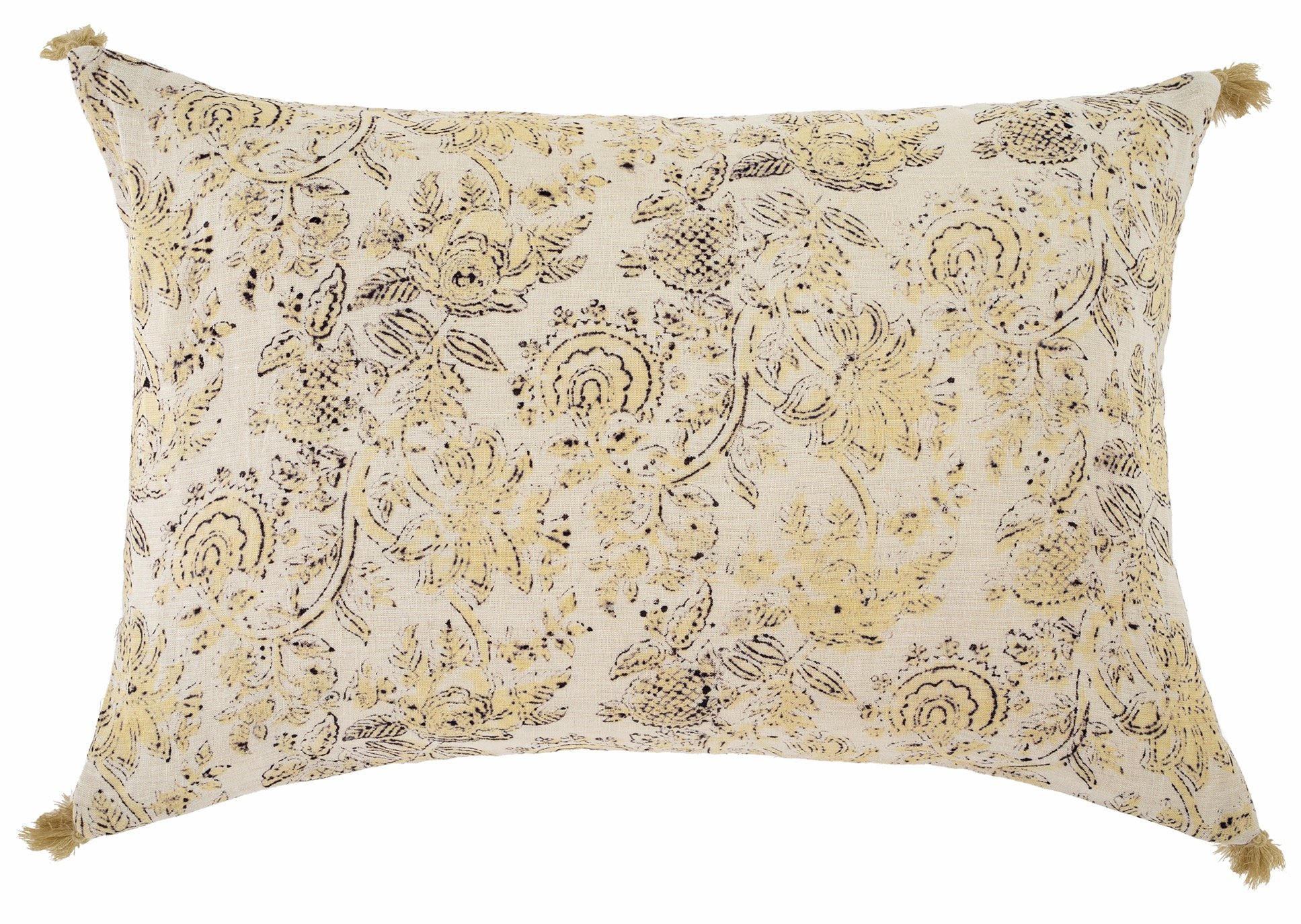
YELLOW
If you’d like to create an uplifting, inviting, and happy space, incorporate a warm, pale yellow (be careful because a bright or intense hue can be too energizing and not at all calming). Like the sun, yellow is warm, cheerful and optimistic.